Doomsday Coffee ROASTERS
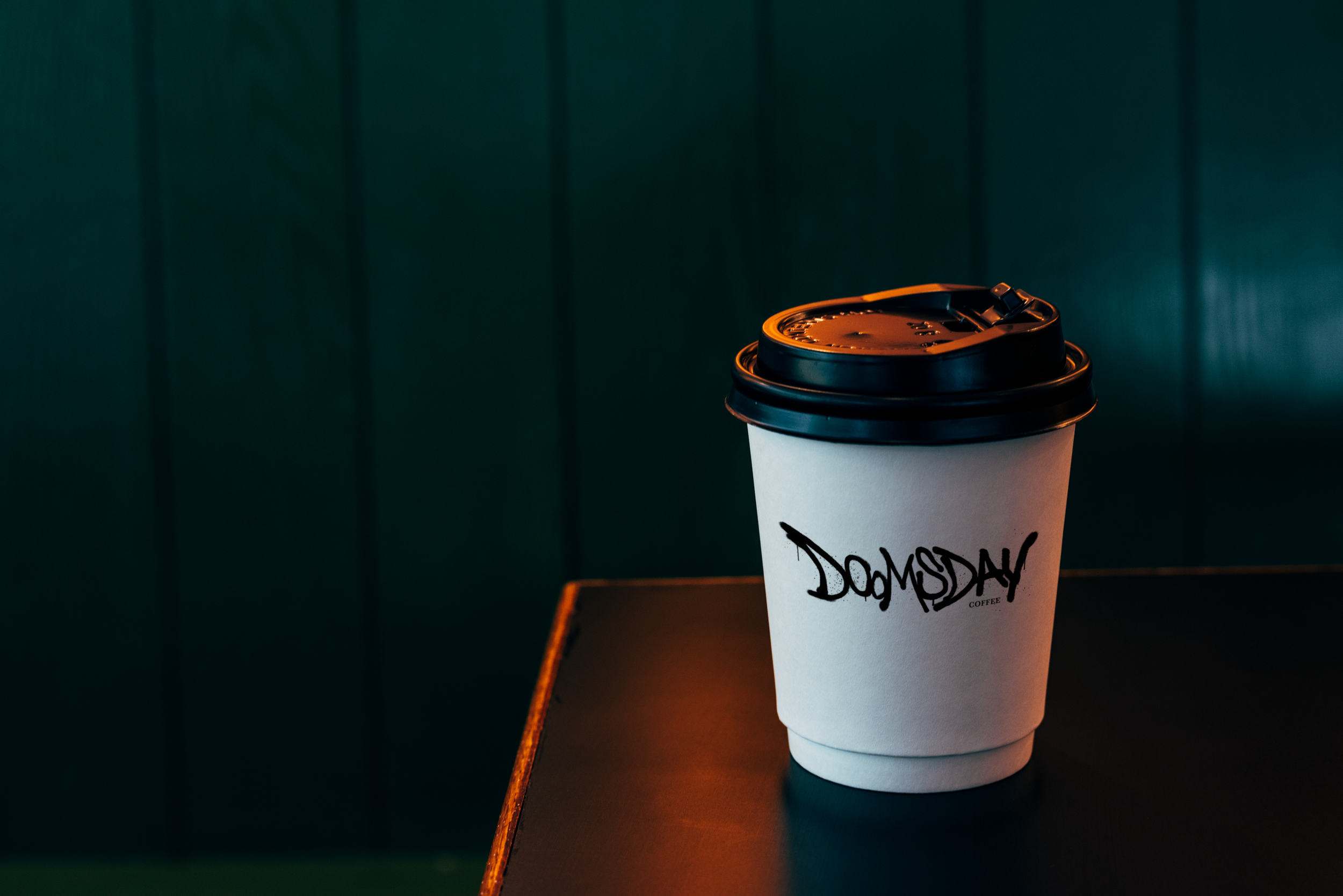
Doomsday is a local coffee shop based in Arkansas, built around the idea that even a bold, dramatic name can feel welcoming and familiar. The brand plays with that contrast — something that initially sounds intense, but ultimately centers on everyday ritual and community. The visual identity features a custom wordmark that feels sturdy and slightly worn, intentionally designed to look spray-painted by hand. That tactile, imperfect quality adds a rawness to the logo, giving it an expressive edge that reflects both resilience and authenticity. It’s paired with bold typography and high-contrast layouts inspired by vintage headlines and old storefront signage.
A grounded color palette of deep espresso browns, inky blacks, and muted earth tones connects the brand back to Arkansas and a sense of rootedness and honesty. Subtle distressed textures and utilitarian graphics add character without feeling overworked. Overall, the identity was designed to feel strong and distinctive while remaining warm and approachable.
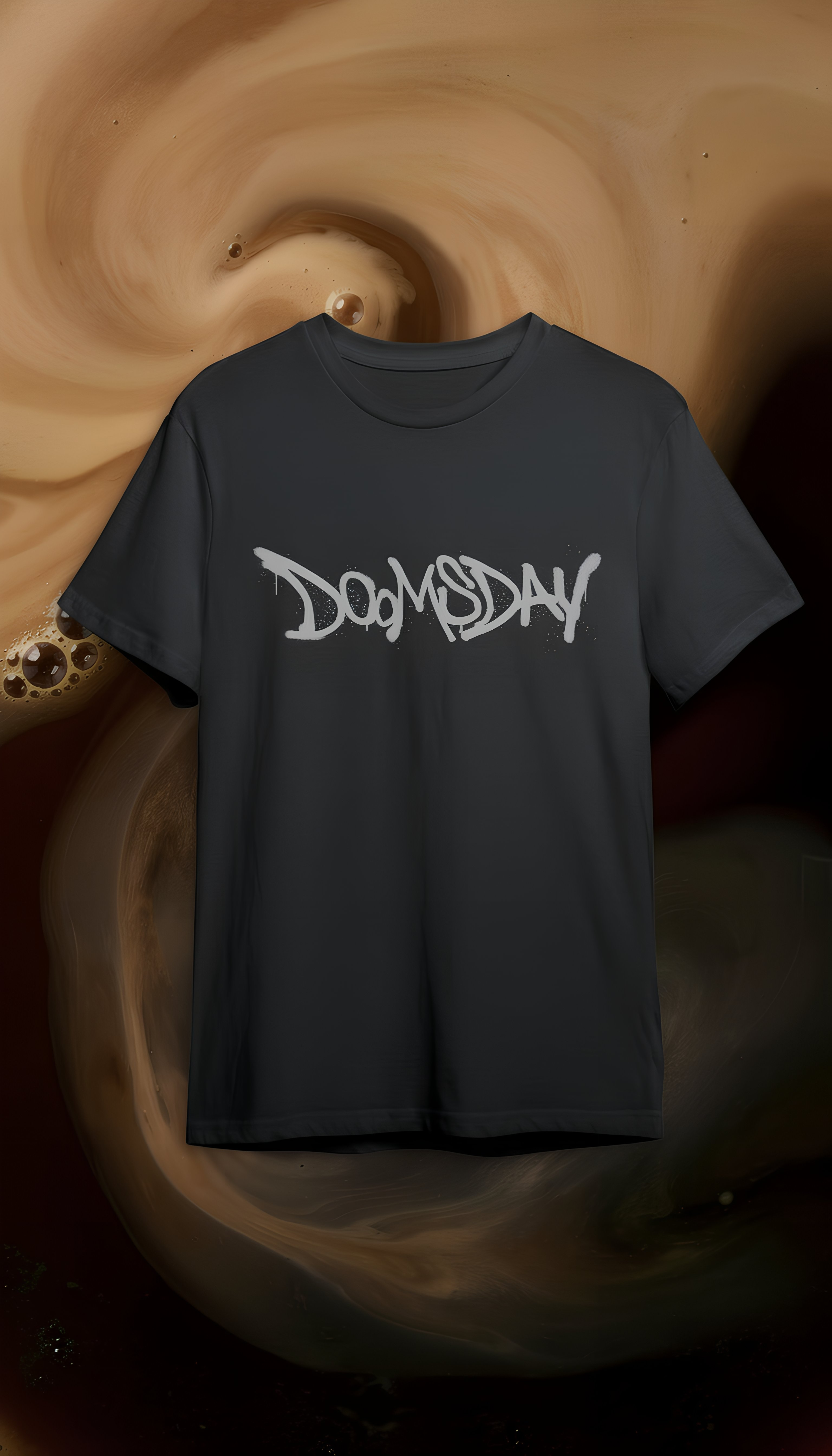
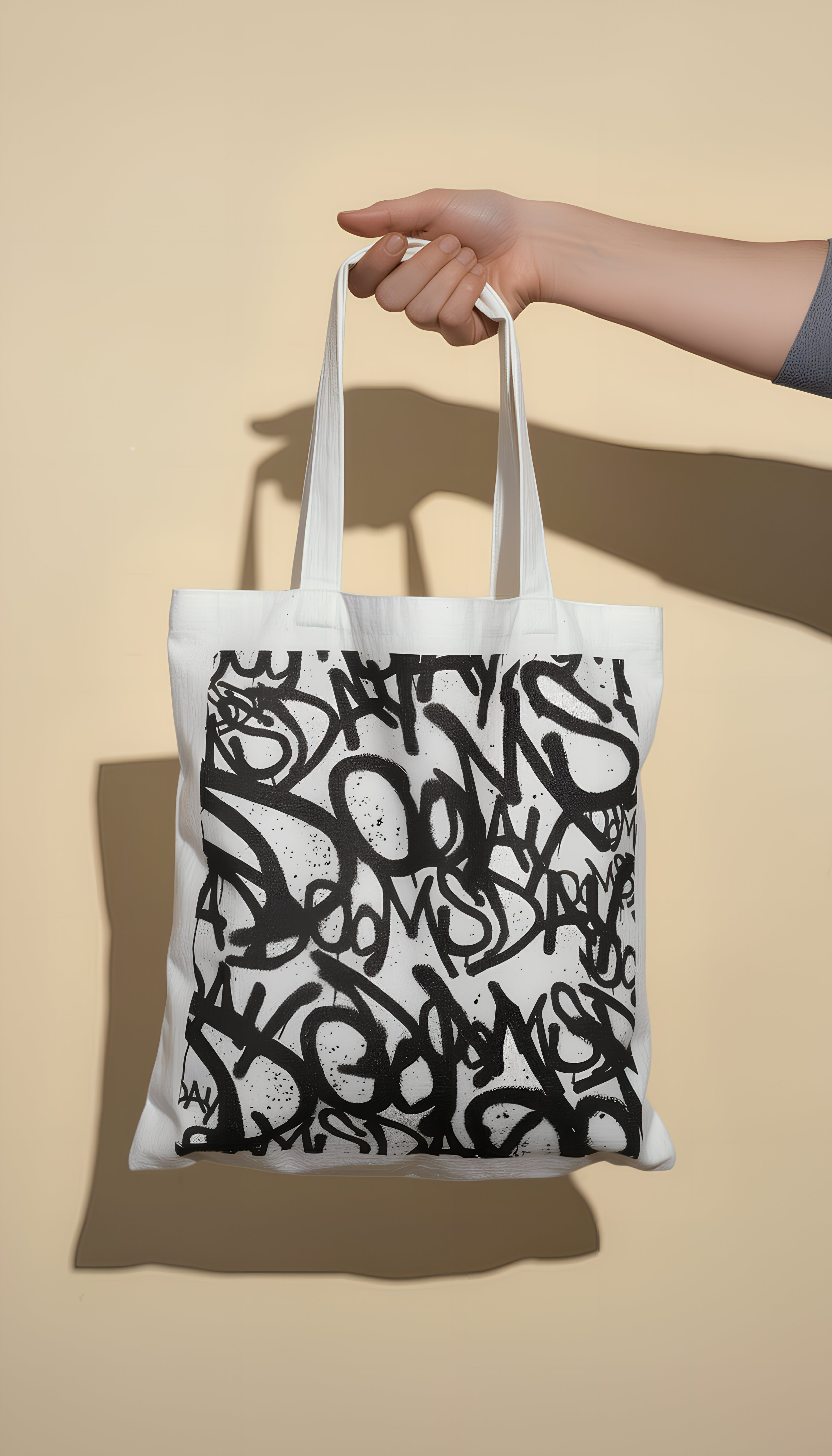
The identity was then translated across a range of touchpoints, from tote bags and drinkware to apparel and in-store graphics. Each application carries the same raw, tactile quality as the logo, allowing the brand to feel cohesive and recognizable whether it’s on a coffee cup or worn as merchandise.